 As part of the Skippy Yippee campaign I was tasked to create a web app which simulates drawing in peanut butter. In addition to a website, the campaign was set to have a duplicate experience inside of a banner ad as well as a mobile ad. HTML5 canvas was the clear choice as it was most widely supported across browsers. The engine itself was built with the EaselJS library to speed up development. In creating the PB Canvas object I developed several versions, using differing techniques. The code itself is very straightforward and available in the EaselJS drawing and masking demos. This article will focus on the creative process and the visual techniques used to create the effect.
Mask Technique
 The initial approach used two images containing varying peanut butter textures. A darker “base” layer was laid down with a lighter “surface” texture over it. The “surface” layer acted as a mask. As the user painted, the stroke would apply an alpha transparency and reveal the “base” layer. The technique worked, but had some issues. With the mask limited to hard lines, the depression effect looked very rigid. Edges were hard and unwavering. Adding a shadow between them helped round out the depression and add a 3D effect. However it lacked the “sloppiness” of peanut butter.
Feathered Brush Technique
The second attempt involved a reverse approach, painting on top of a textured image rather than masking it away. I used solid colors so I could apply a shadow property of same color to give the line a feathered edge. By toning down the chunky peanut background texture I was able to hide the fact that it was painting in solid colors. The technique was further improved with a PhotoShop style jitter; changing the brush size and color slightly with each stroke. It was beginning to look more fluid but lacked a clear 3D look, it was closer to finger painting than depressing a surface.
Multi-Brush Technique
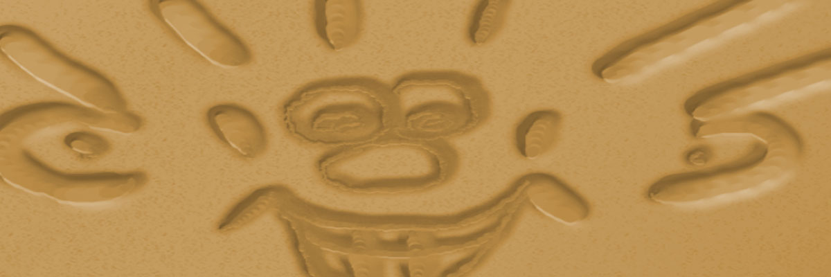
 Building on the feathered brush, I began to experiment with stacking several lines of different width and color on top of each other. The idea was to give the illusion of highlights and shadows. By offsetting the X coordinates, pushing shadows to the left and highlights to the right, the 3D effect started to take shape. The final version has 4 brushes painting in tandem: baseline, highlight, shadow 1, and shadow 2. The image below breaks down the appearance of each stroke and what they look like when they stack together. To keep things manageable, I put the brush values in an array and then issued the draw instruction in a loop.
By darkening the color, and shrinking size and distances of the 4 brushes, I was able to create the effect of digging deeper into the peanut butter. For each line segment I set the depth effect relative to its distance. A slow deliberate line appears to dig much deeper than a fast one, similar to drawing with a pencil. Applying a random jitter to the brush size, color and position gave it an extra sloppy look. This trick had the added benefit of being able to paint over an existing line and see the texture change.
I expanded the multi-brush technique to simulate alternative drawing instruments such as a knife and a fork. Try it out below. For more information on the Skippy Art project and a link to the live site, check out the portfolio page.
