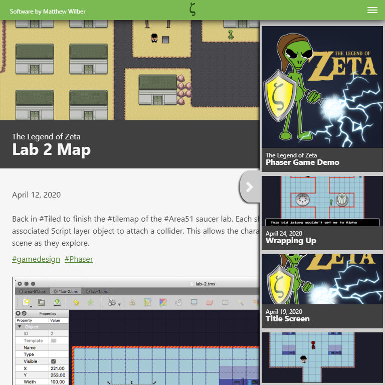
Rather than try to stack the sidebar content like the old site, I opted for a slide-out version. This gives me more freedom to add content without worrying about the overall layout. The mobile sidebar sizes to the screen and scrolls overflow content.

